Into the fold
Client
Norsk Etikett
Deliverables
Design strategy
Visual identity
Art direction
Digital design
Motion design
Year
2021
Credits
Børge Myrnes
Moxey
Funbit
Nils Erga
Norsk Etikett is a leading supplier of self-adhesive labels with headquarters and production in Sandnes, Norway. They are a family-owned company with a long, proud history.
Norsk Etikett wanted a new visual identity and a website that reflected their position as a specialist printer with an ambition to remain at the top of their business. They needed a visual expression that underscored their shared dedication to their craft and customers.
In close collaboration with the client, a new brand platform was developed. It underlines the importance of sustainability, active social inclusion, gender equality, and workers’ rights.
“Collaborating with you guys has been great. You communicate your ideas clearly and in a structured manner, so it becomes possible to envision the final result early in the process.
We love our new visual identity. It truly inspires us and has become a symbol of what the future holds for our company.”
— Petter Haaland,
CEO, Norsk Etikett

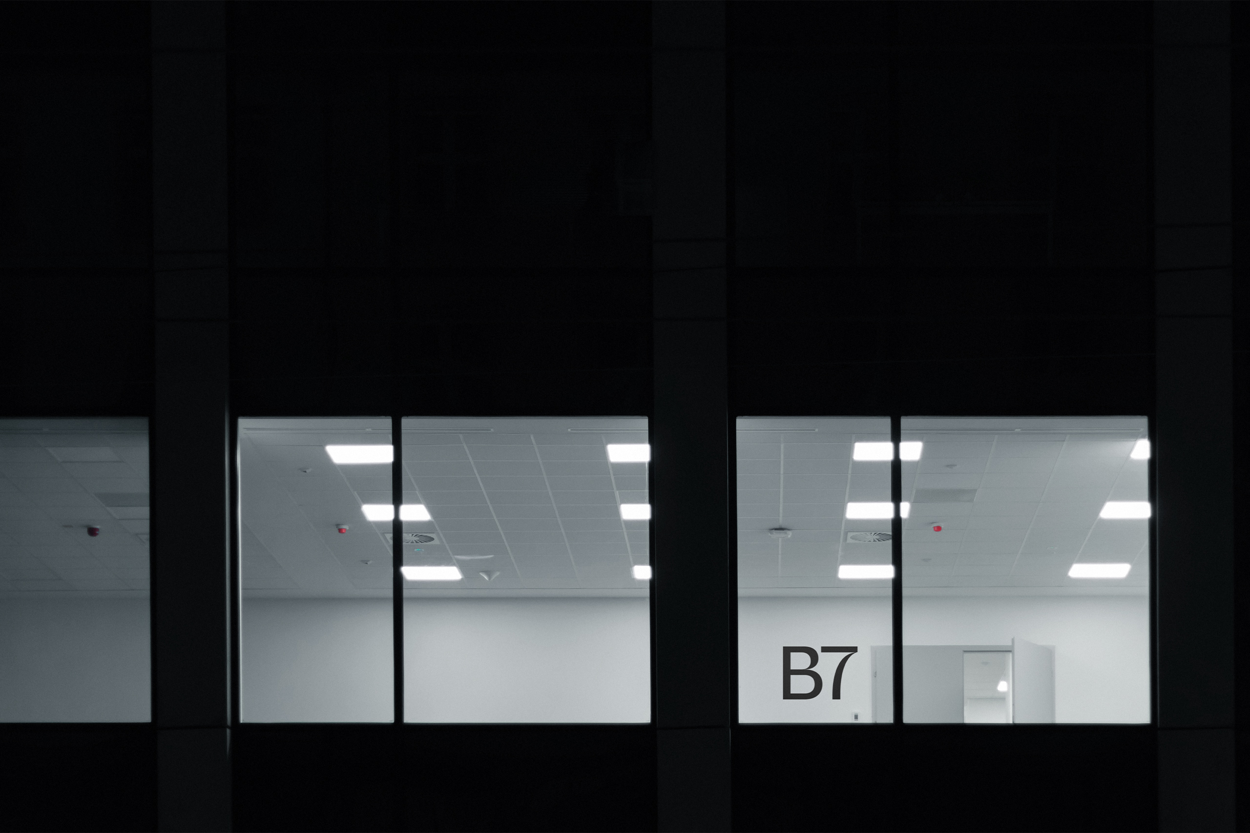
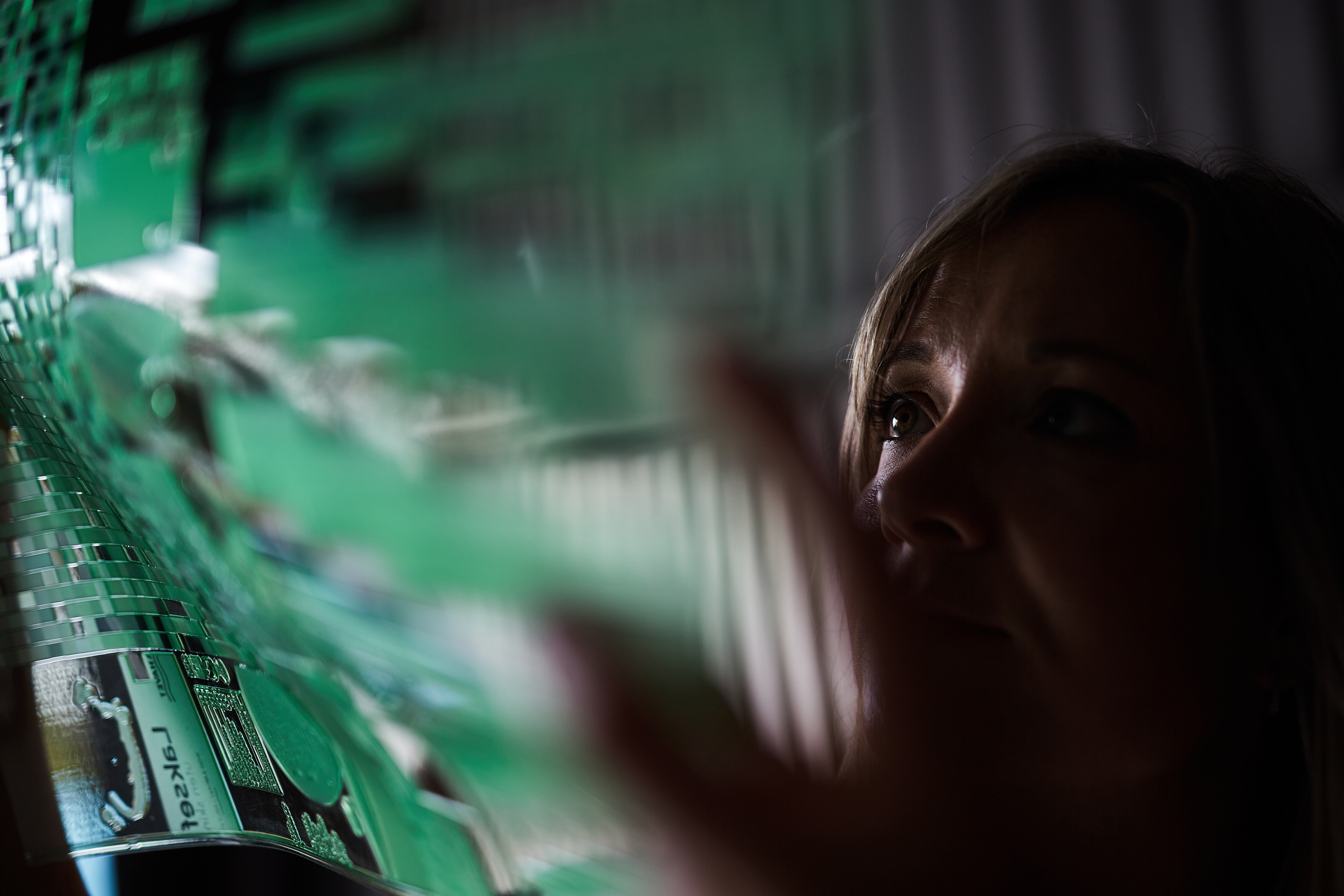
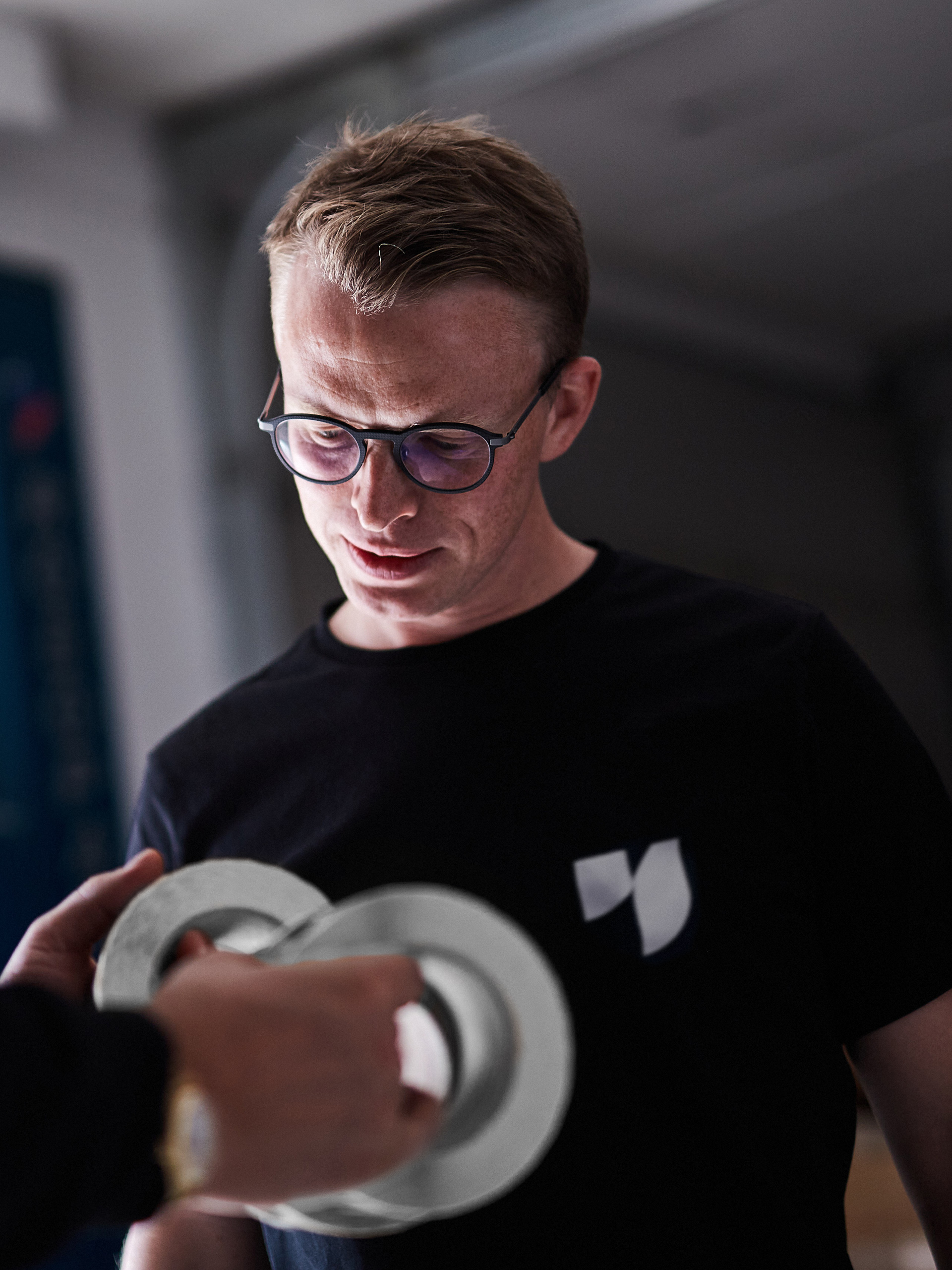
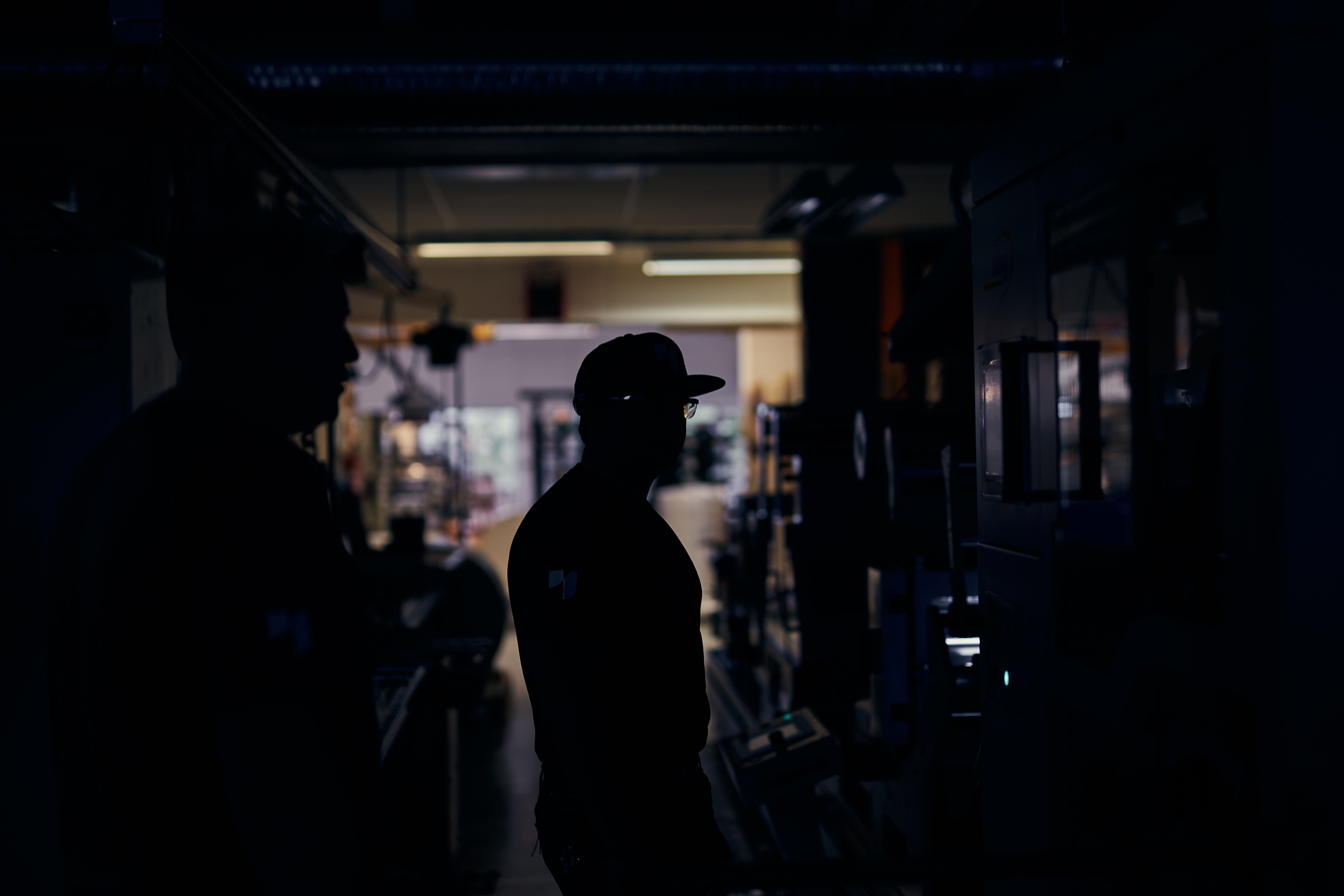
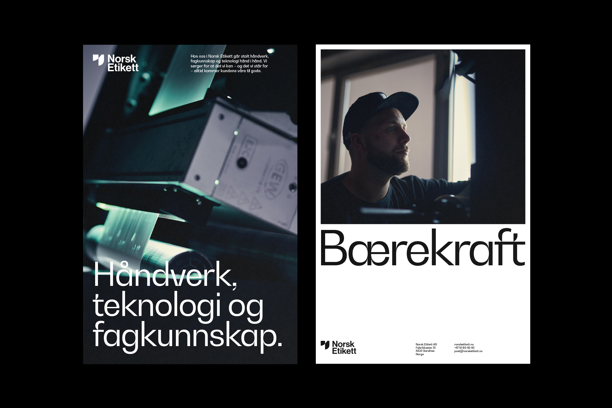
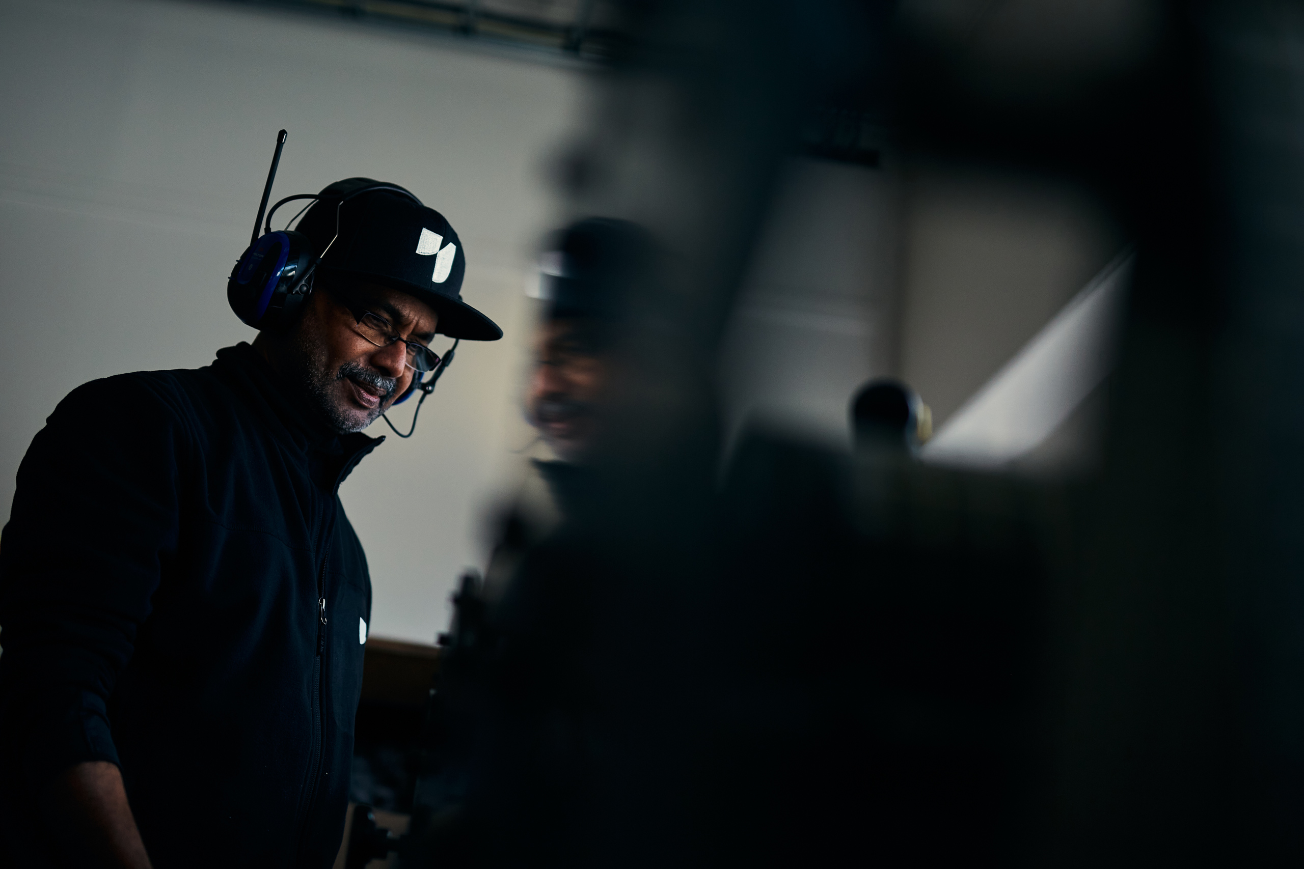
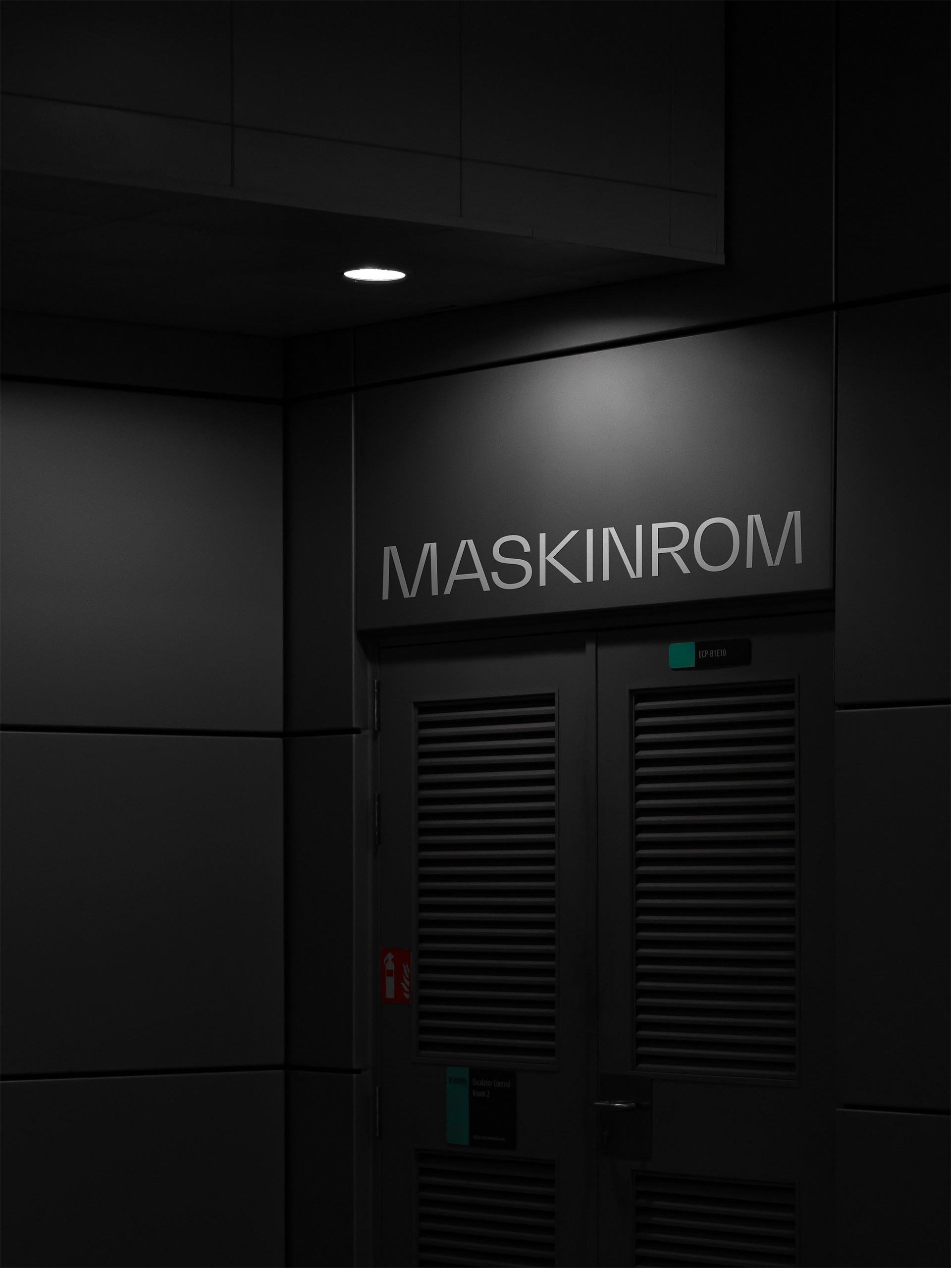
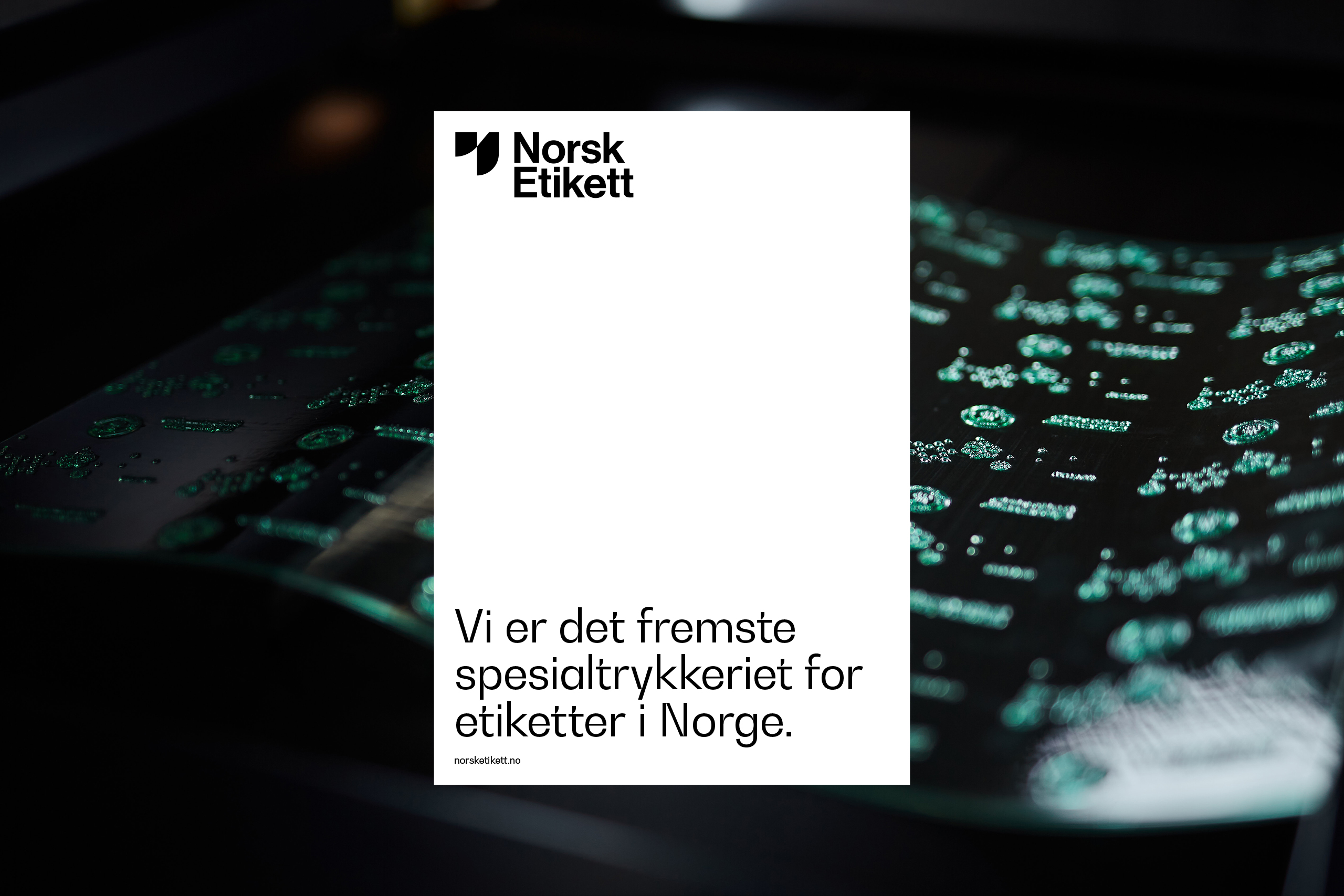
To visualise the craftmanship of making high-quality labels, we documented the intricate production process closely through a series of snippets and images.
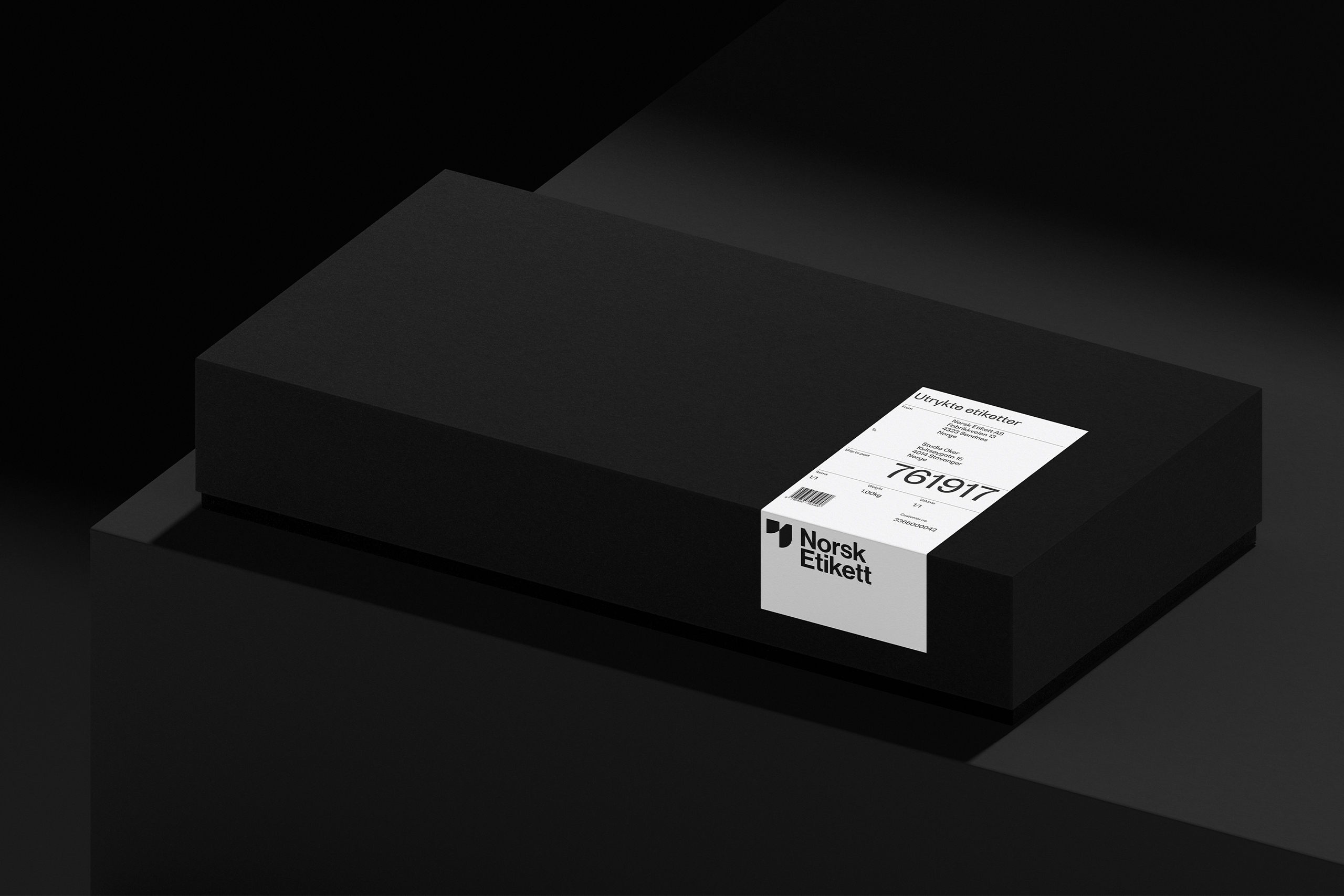
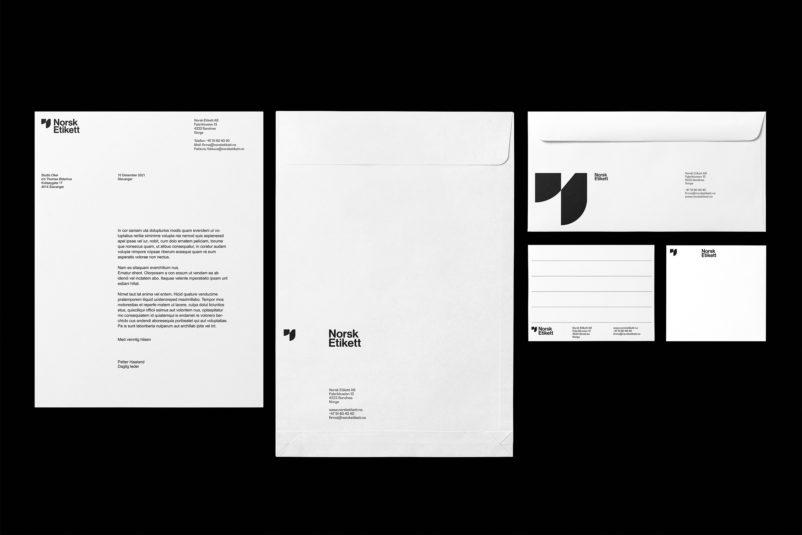
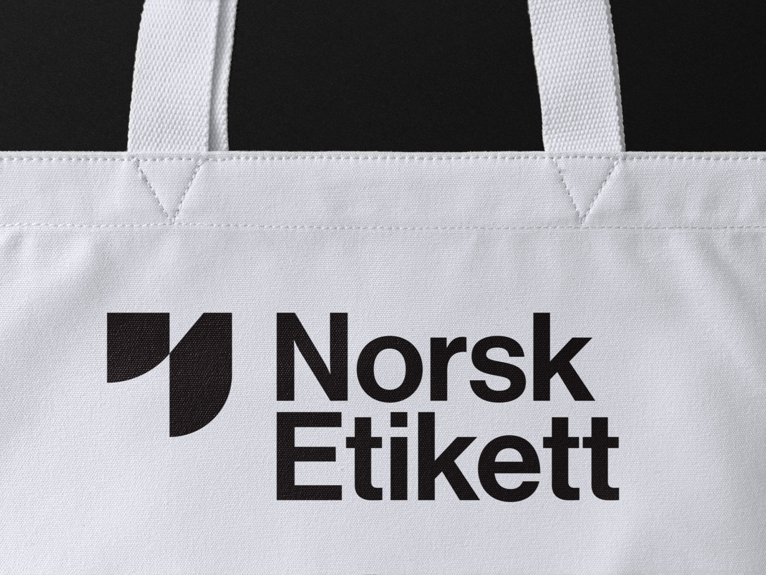
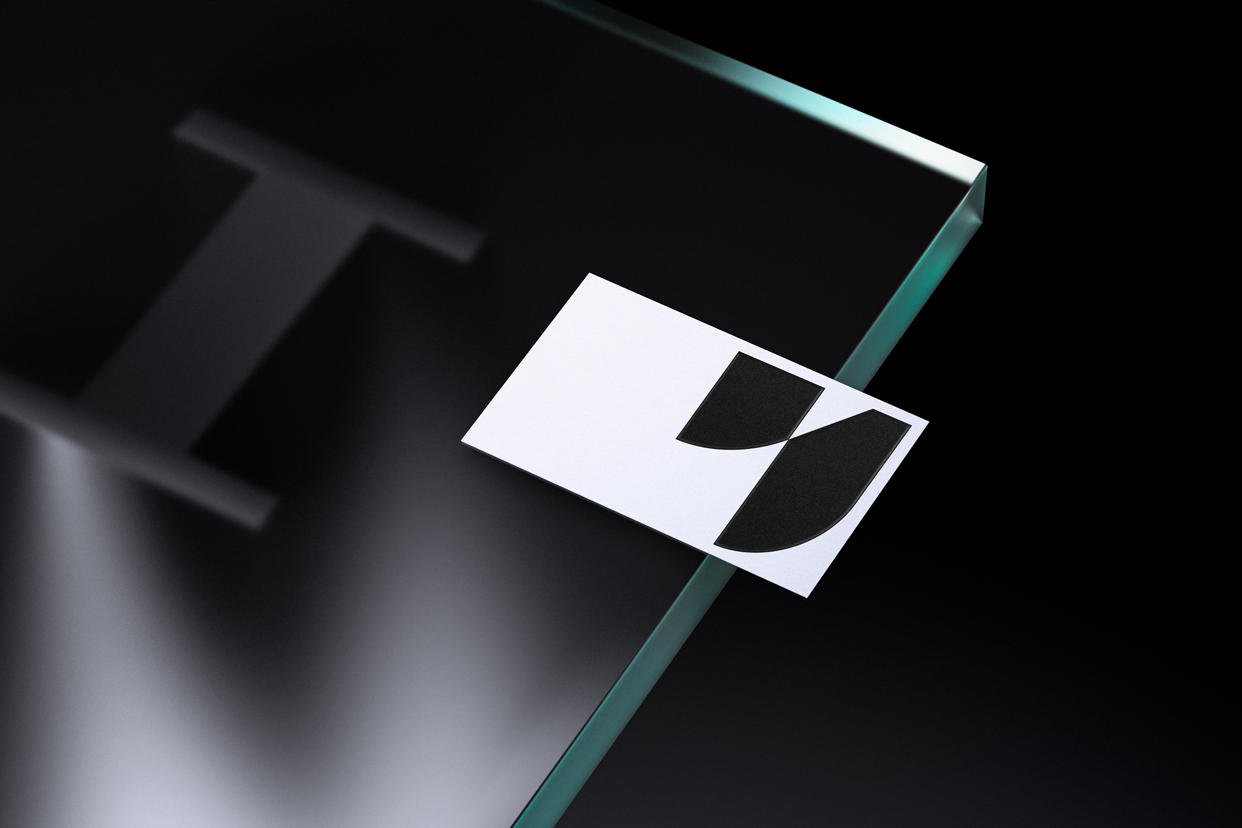
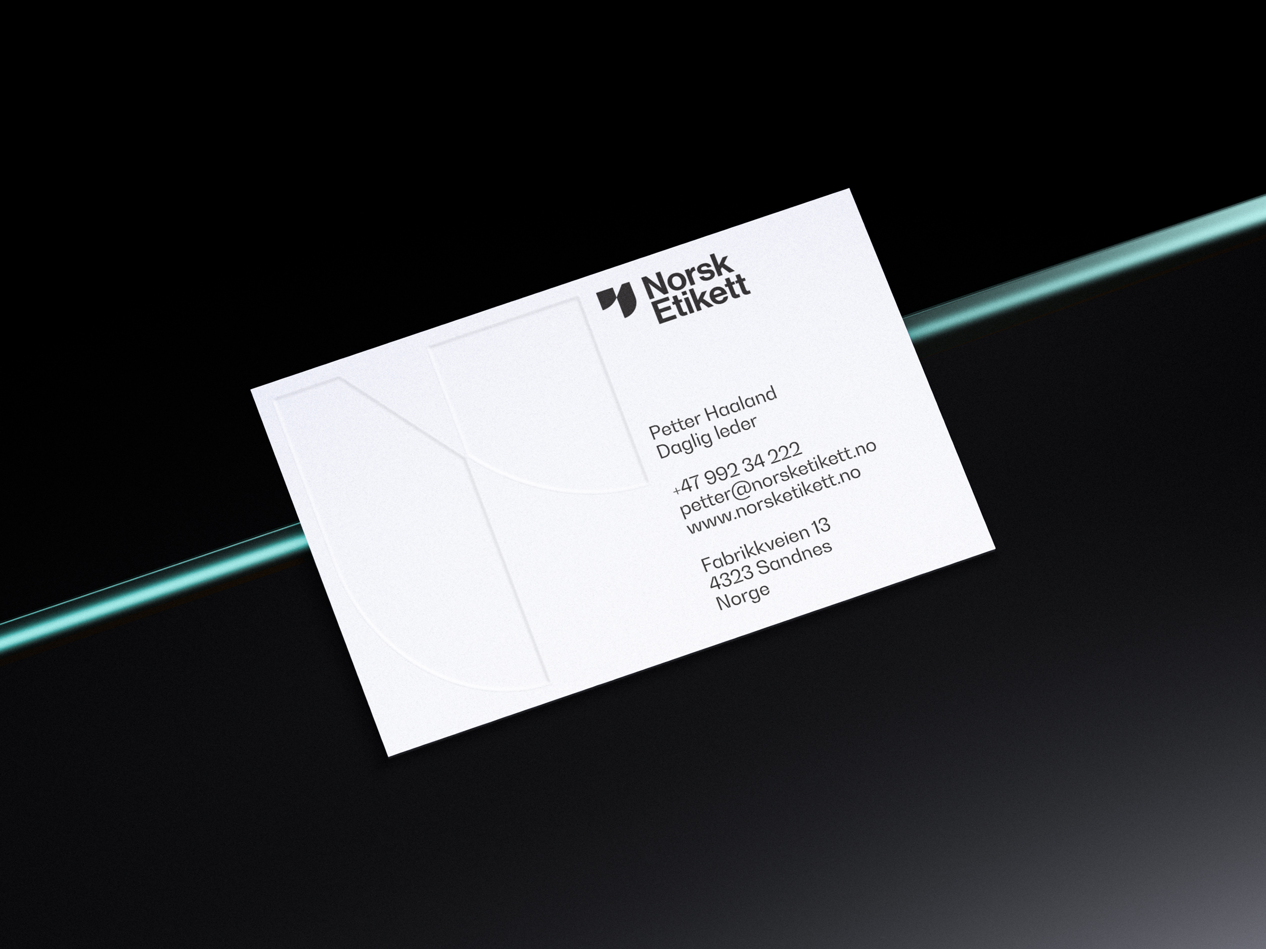
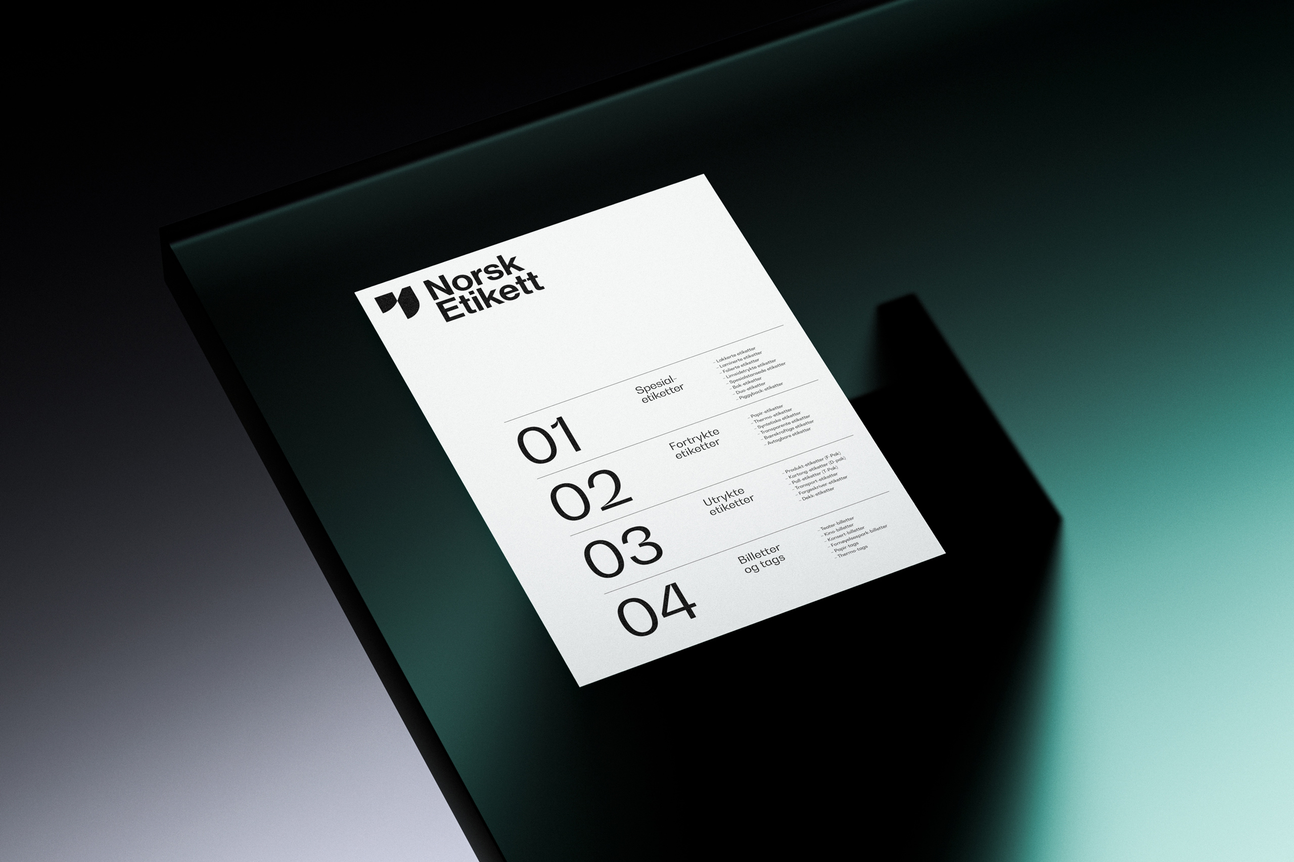
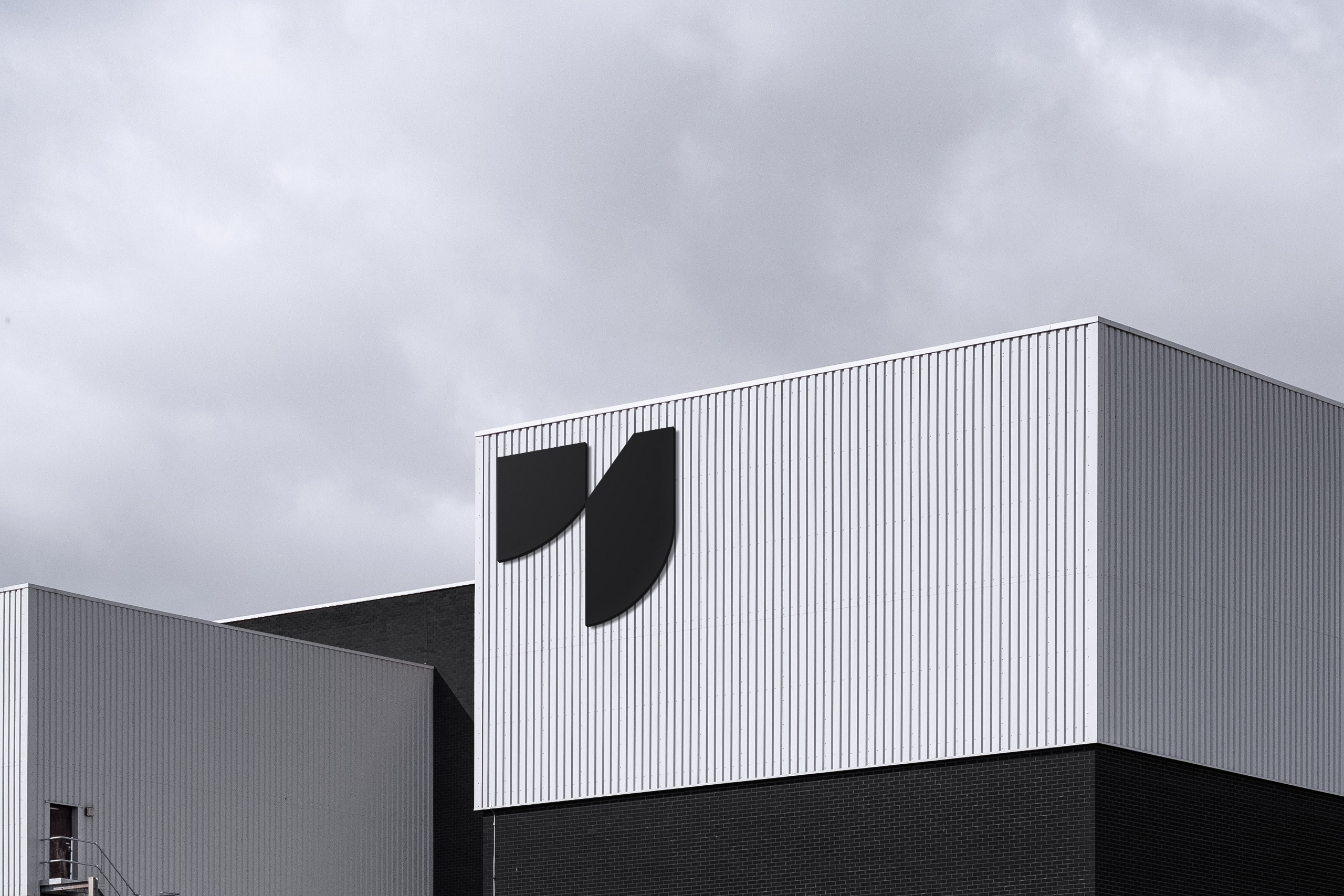
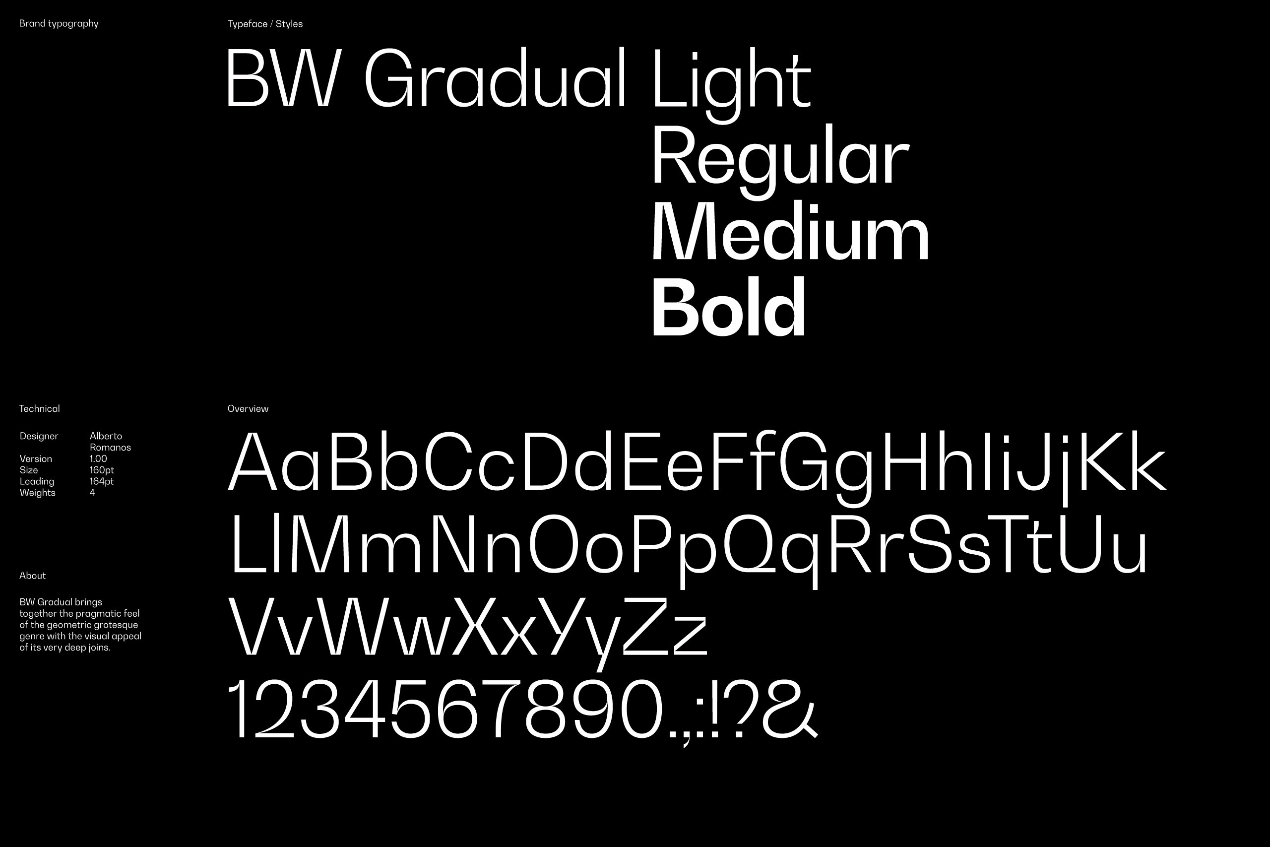
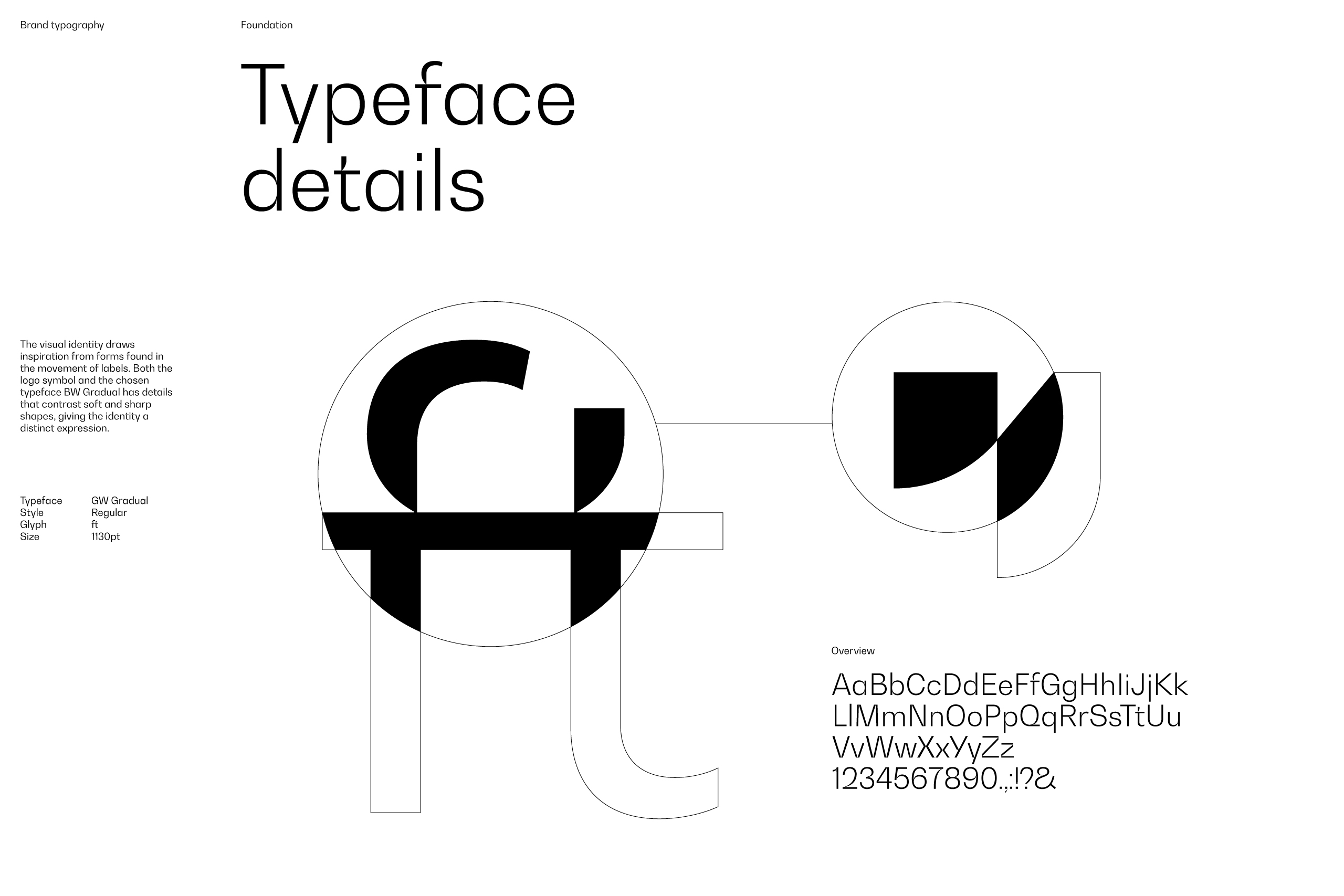
The visual identity has a timeless expression that draws inspiration from labels in motion – being printed, cut, or pasted on a product. Both the logo symbol and the selected font, Bw Gradual, show contrasting soft and hard elements, giving the visual identity its distinctive character.
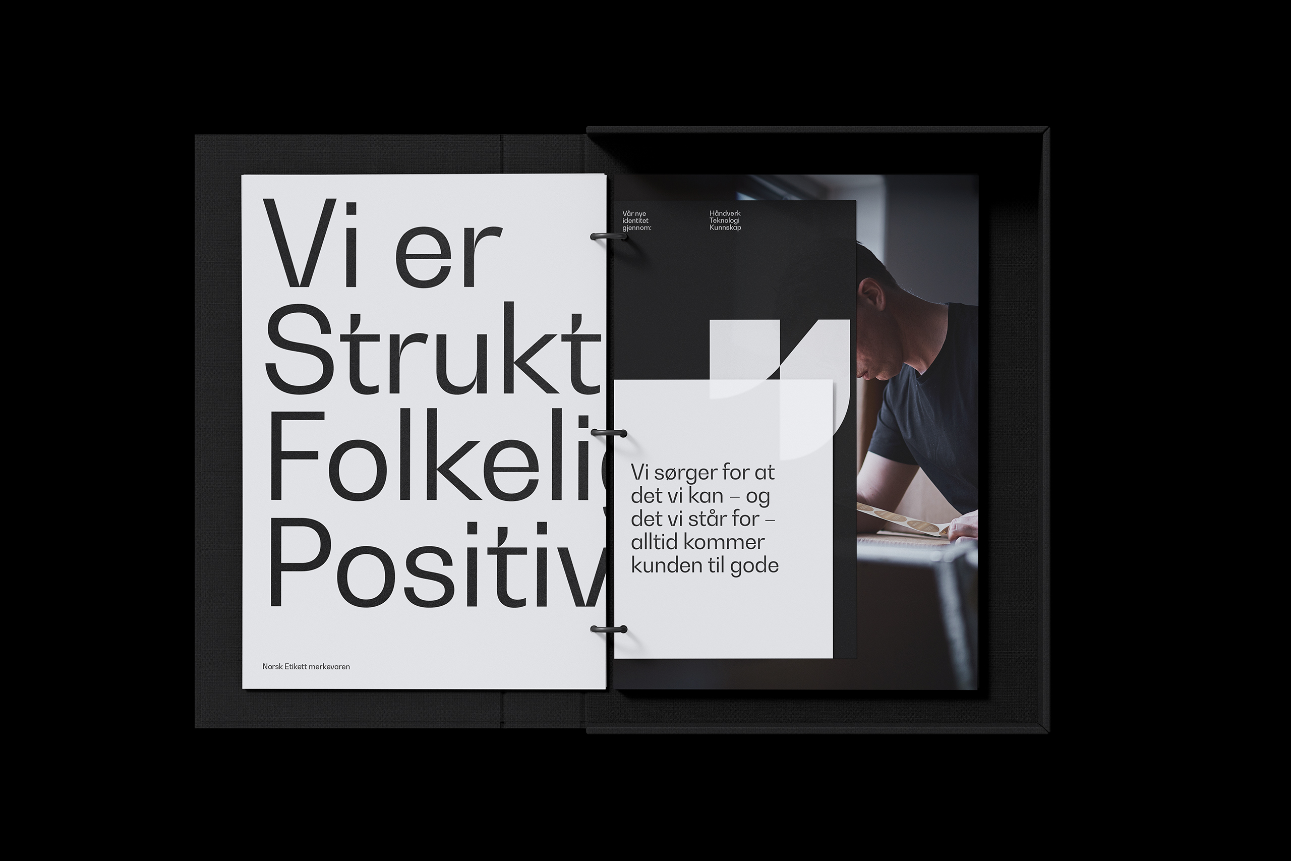

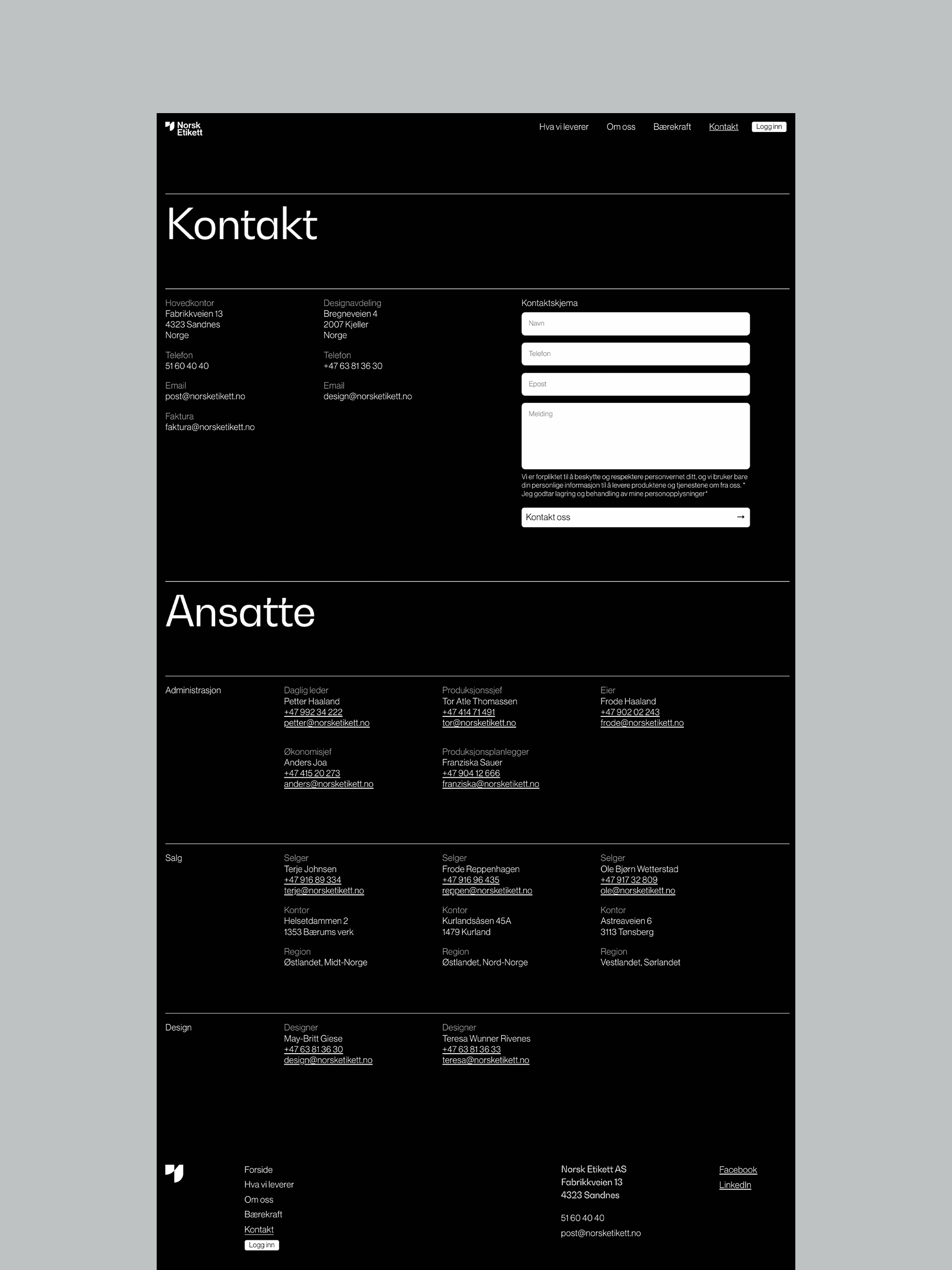
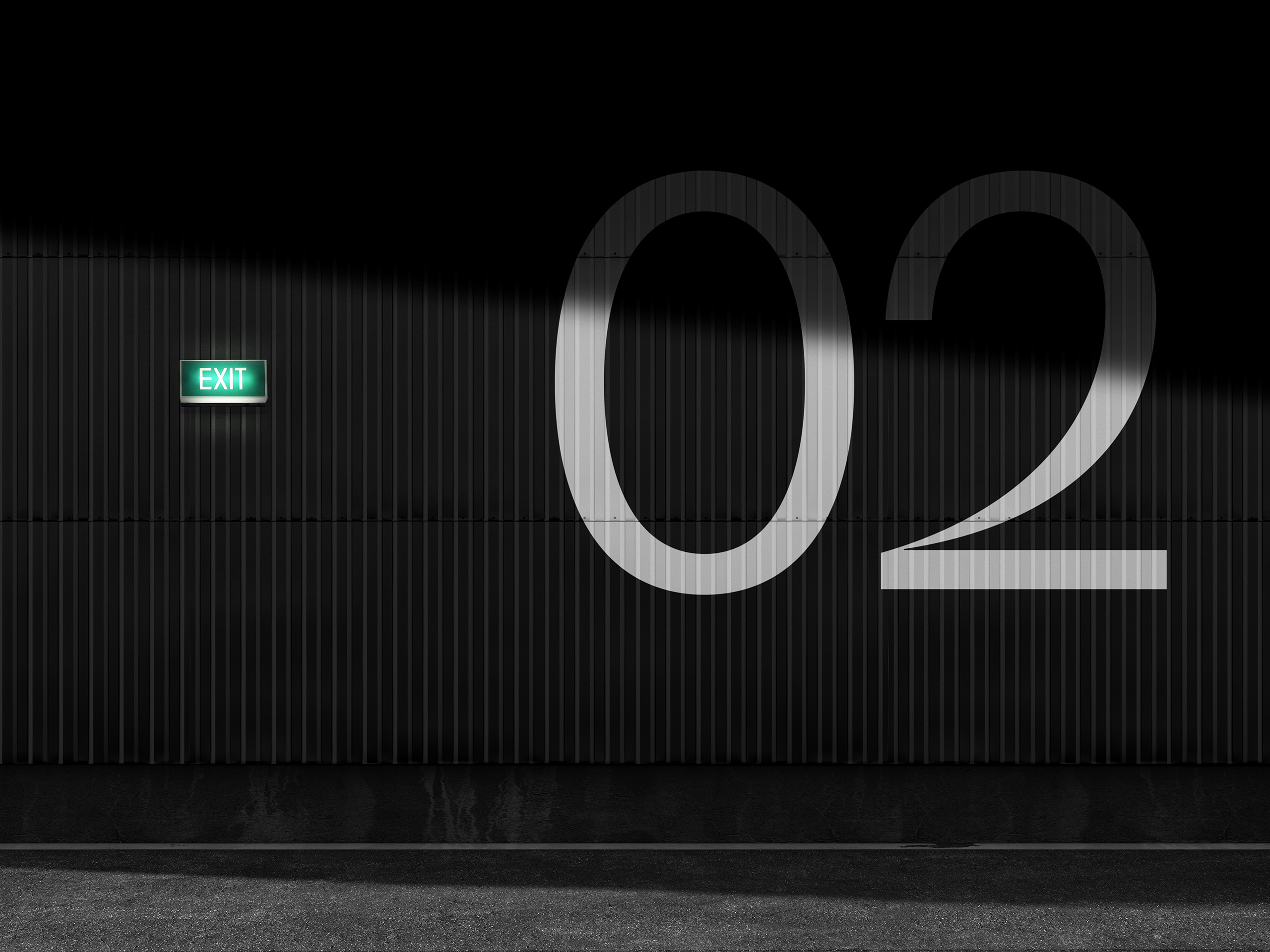
The new website uses a strict grid and subtle layered details to enhance the qualities of the visual identity. It highlights Norsk Etikett’s people, skills, and core product: the label.